OutWellness
Logo Design, Branding | Oct 23 - Jan 24
Rebranding for OutWellness Physical Therapy + Fitness in Austin TX, an all in one health & wellness space for members of the LGBTQ+ community and allies.
Role: Graphic Designer

“Ugh. It's truly magic!”
— Syd Young, OutWellness Founder & CEO
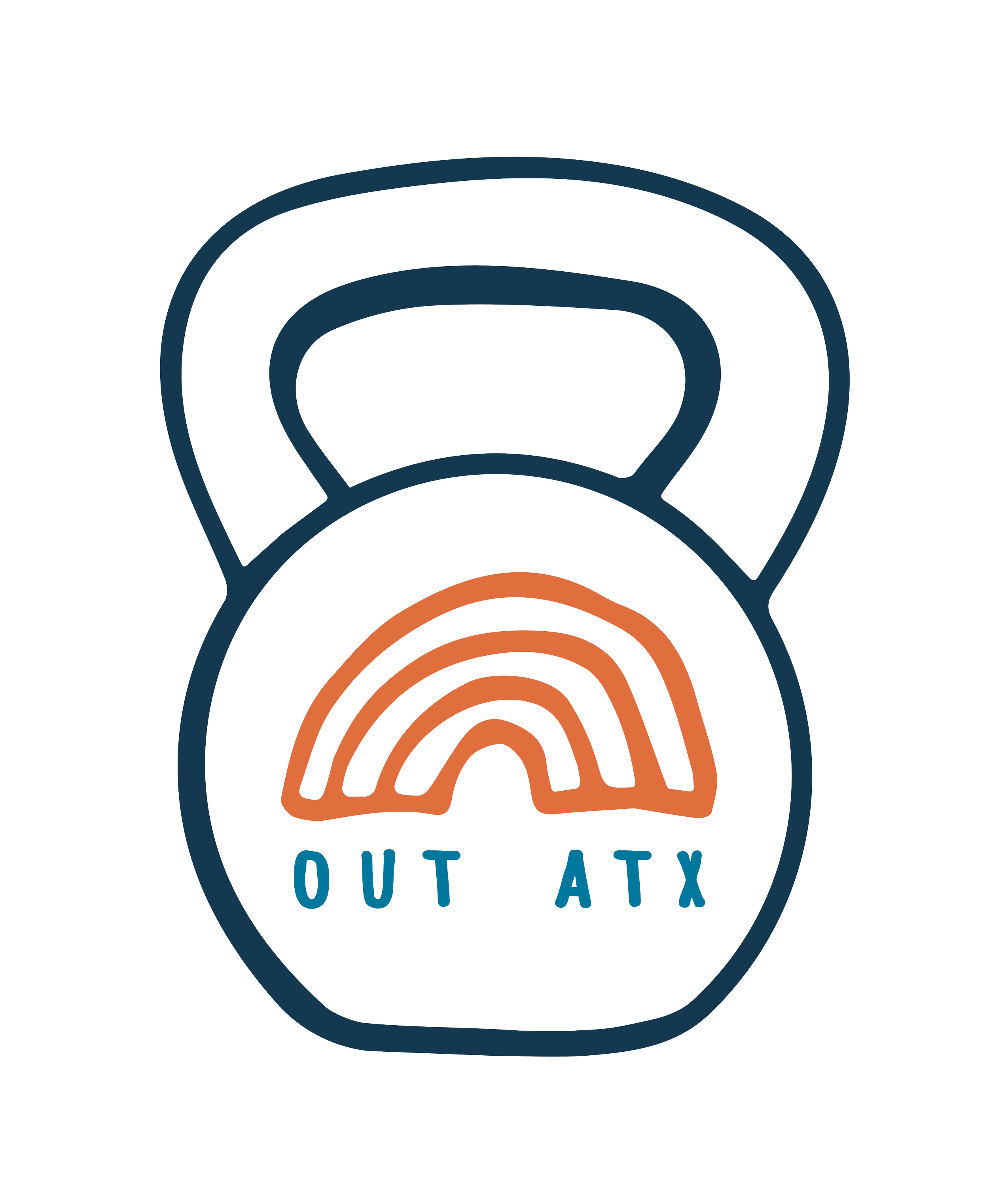
OutFitness
From
to
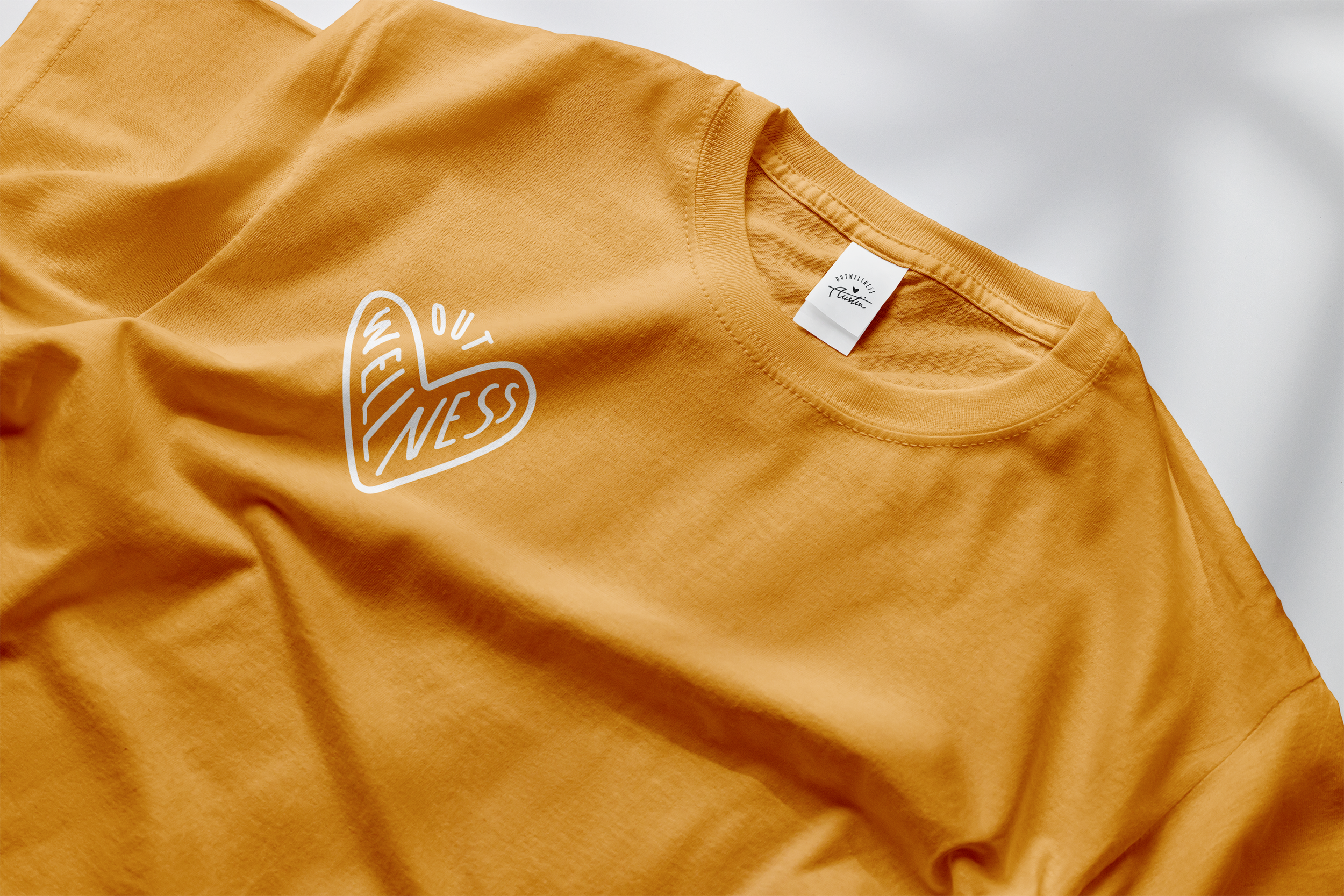
OutWellness
Previously OutFitness, the brand is so much more than just a Fitness space, including physical therapy & post-transition surgery therapy, hence the word Wellness emerged.
Branding that exudes inclusivity and queerness within the wellness space, without the typical pride colors, with a touch of the quirkiness of Austin!
THE ASK
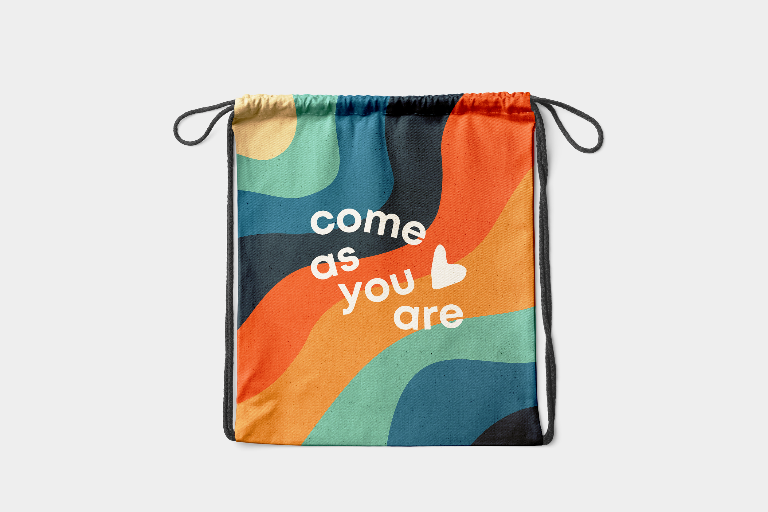
Being in the wellness & physical therapy industry, soft edges and overall aesthetics were chosen, staying away from sharp edges and bold, bright colors. To be quirky and inclusive at the same time, we highlighted the beauty of imperfection. We do so by forgoing perfect symmetry (as can be seen from the heart, and even the OutWellness is not a perfect spherical curve). Cursive and handwritten lettering were chosen to evoke friendliness, added a human connection to the overall brand.
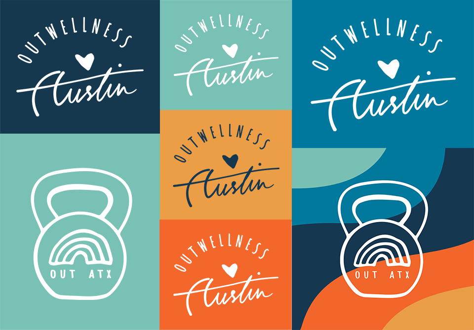
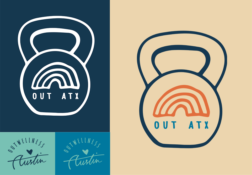
THE SOLUTION
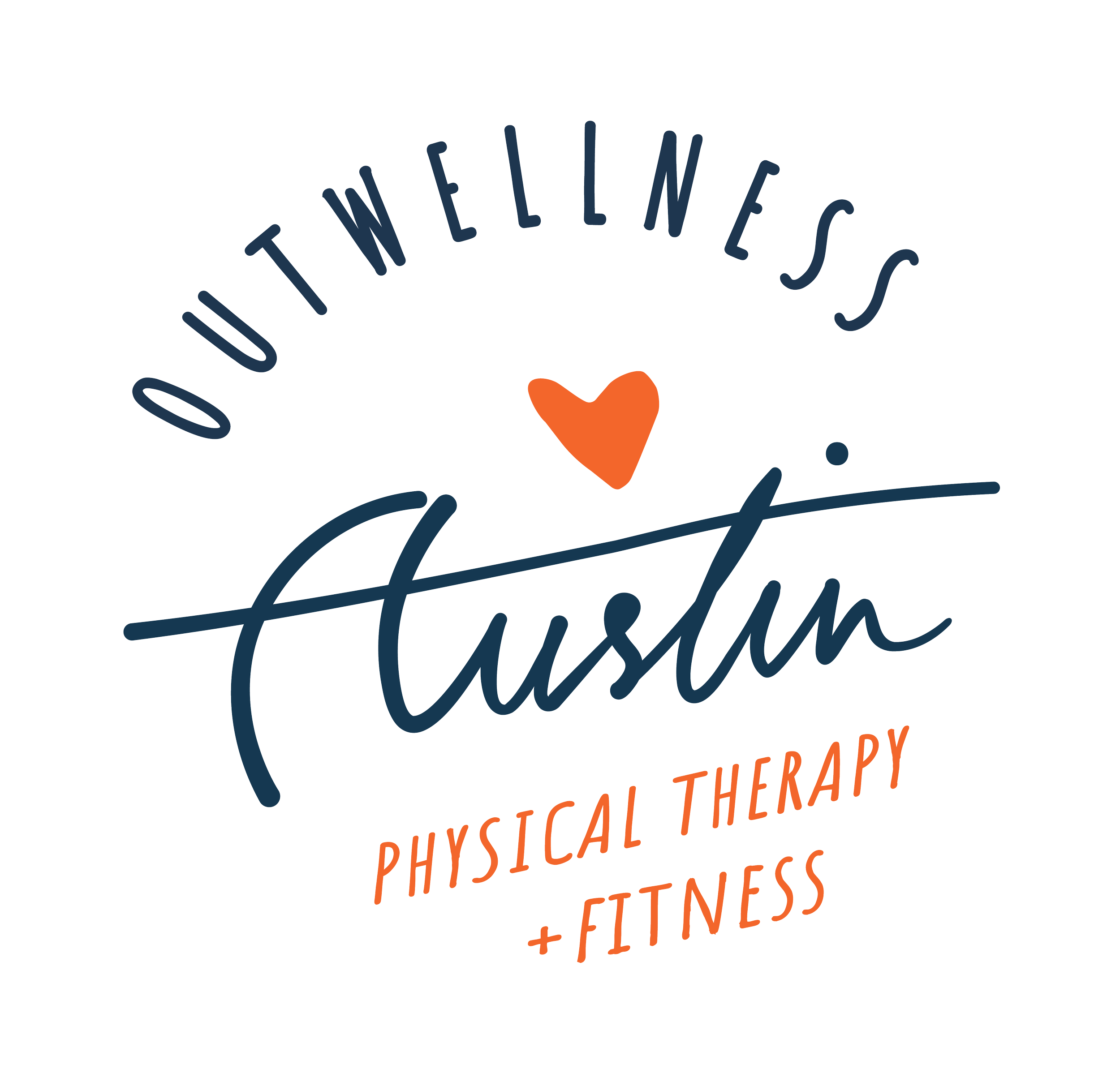
Primary Logo
Secondary Logo
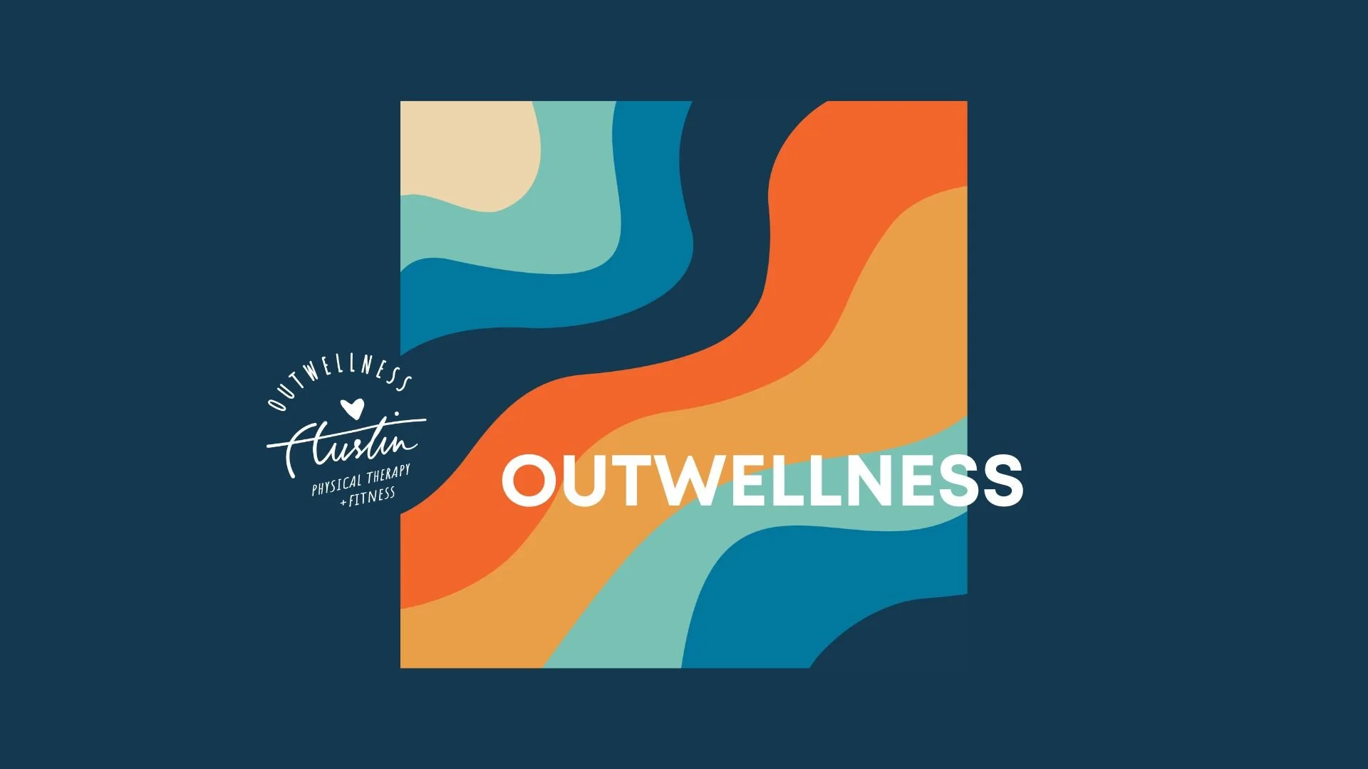
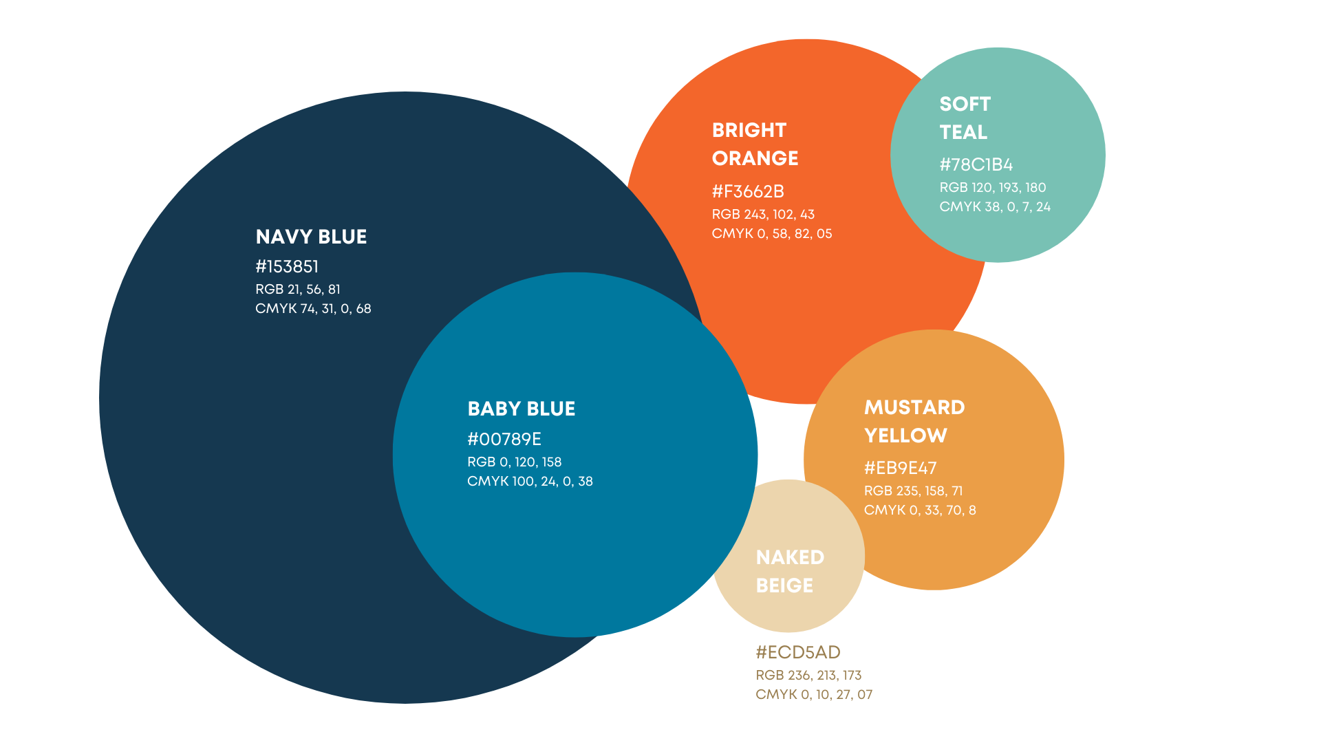
COLORS

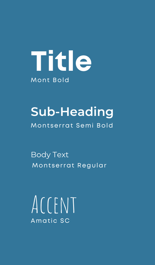
TYPOGRAPHY

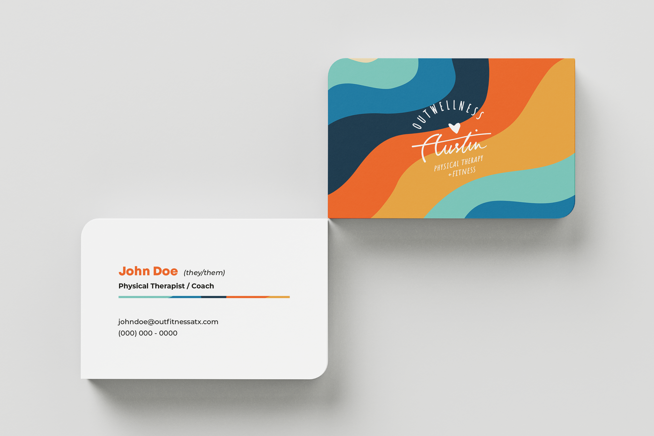
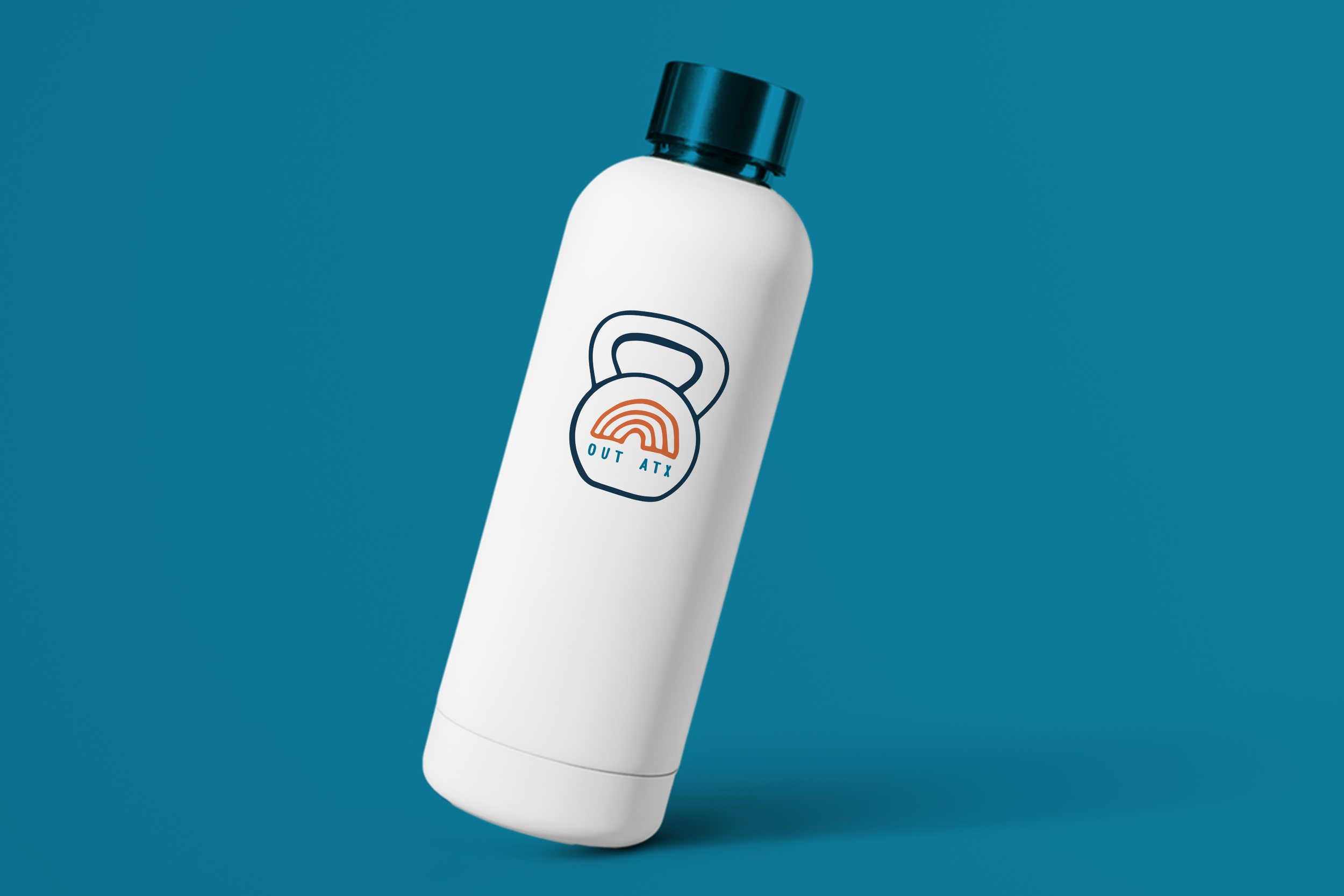
OTHER ASSETS